Self-Publishing 101: Maybe don't market your literary novel in the style of a manga
or, why I re-launched my novel art
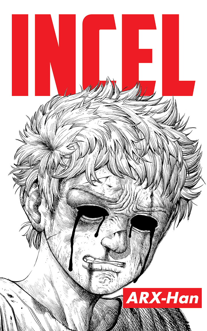
When I first published my novel INCEL in the summer of 2023, I had the idea of packaging the novel with an anime/manga aesthetic. While I’ve mostly had good experiences working with artistic and design freelancers, I really lucked out with my particular artist and found someone who (a) was skilled technically, (b) could translate my art direction incredibly effectively, and (c) was easy and reliable to work with. At the time of launch, I was frankly thrilled with the quality of the illustrations, which I’ll post for posterity’s sake here:


I really do still love this art, and in all likelihood, I may re-release this “anime-cover” aesthetic at some point down the line.
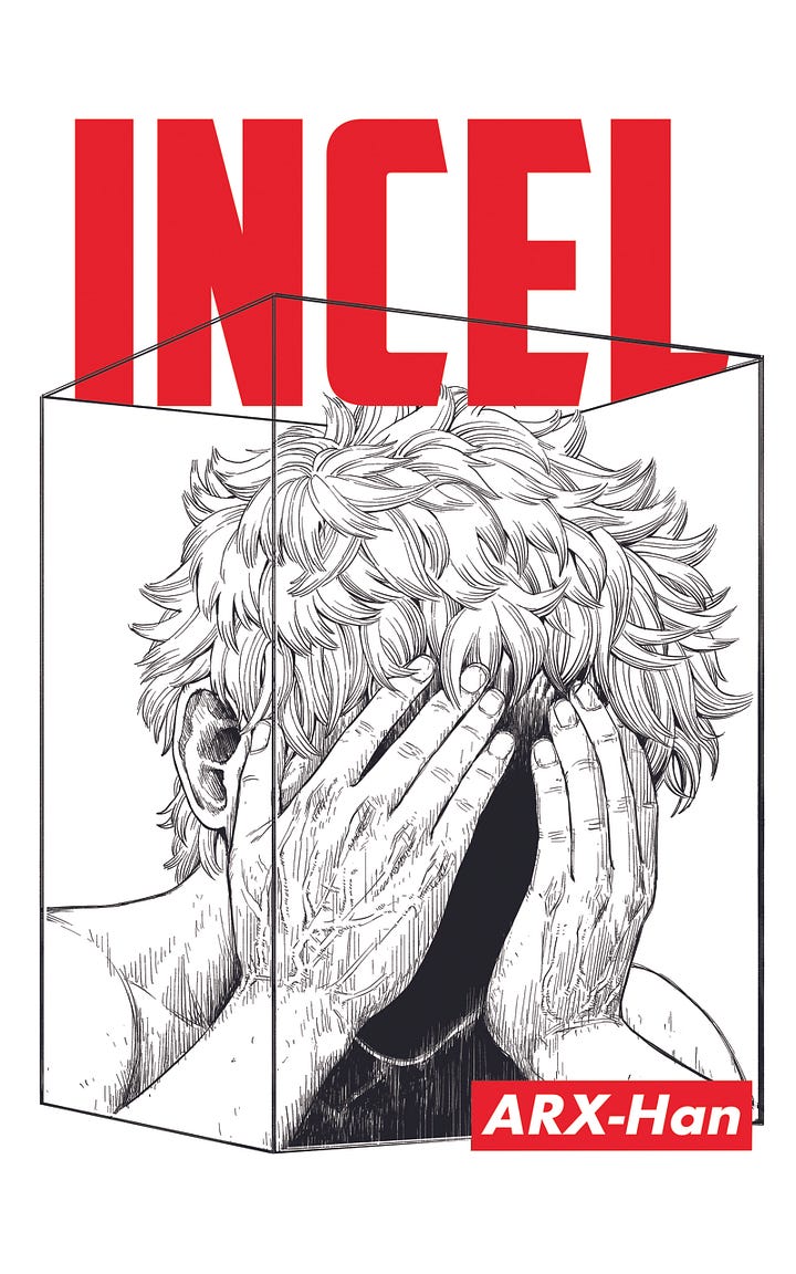
Because this was a labor of love, I also had a completely different set of art done for the hardcover as well:


I don’t consider myself as anything other than a casual anime watcher—having really only watched a relatively small number of highly popular series—but there’s something deeply evocative about the visual language of the genre, which probably explains why it’s achieved such universal cultural appeal (when I was growing up as a millennial, it was much more a niche phenomenon).
The general thrust of what I wanted to do with this experiment was to combine anime aesthetics (which I assumed young men were partial to) with a serious literary work in a way that hadn’t been done before. This unusual combination was appealing to me in that I felt that books intended for men are often packaged in an ugly or boring sort of visual coating, and I felt there was an opportunity to do something different.
In addition to this, I had the loose idea of eventually adapting my novel into a manga (which I may at some point still do), and so I also commissioned colored versions of the back covers and asked the artist to throw in some faux-subtitles to give the impression of that they were screenshots from an already-existing anime adaption:

Most self-published authors don’t have the time or resources to finance this sort of art production, and I don’t exactly recall the price I paid for all of this art (I think it was about $2k or so, if memory serves me correctly). While it took a lot of time and back and forth between me and the artist, it all came out quite beautifully in the end.
I also supplemented this work with simpler advertising-focused commissions from the same artist, which were meant to be a humorous riff on typical self-serious literary book marketing:


Lastly, in order to match this aesthetic, I also had the same artist create my author anime-avatar, which started off with something that looked a little too Japanese/try-hard:


So, we scaled it back into something that was more measured:


Weirdly, this came out looking sort of depressed, so we made the glasses more opaque to come back to something more-in-the-middle of these two extremes:1


For the blog, which is more tech-oriented (and less literary-oriented), we settled on pit vipers (this was a throwback to a trend from Solana summer in 2021):


I like the way the glasses came out for this one and it gives an entirely different feeling, so I may switch over to this avatar for my Twitter account down the line (right now, I’m only using it on Substack).
In which I learn to avoid category-confusion
The novel art was received in a highly polarized way: people either loved it or hated it.
One of the most valuable experiences I had was being able to read comments on /lit/ about how much readers hated the cover and how intensely negative the reaction was. The perception was that INCEL was effectively just another meme-book, i.e., not a serious literary attempt at fiction. This was an unusually helpful experience in that it was a form of crowd-sourced reaction to the aesthetics and presentation of the book. Most authors are not so lucky as to see the unvarnished opinion of their novel’s first impression in such a stark and immediate way.
However, I was slow to understand the message being communicated.
At first, I assumed that this reaction was primarily a function of othe particular aversion that posters on /lit/ have to anime and manga as an art-form in general (which is not an unreasonable aesthetic disposition by any means). Probably out of politeness, the people who did like the cover were the ones who would comment favorably on it over social media.
But a recurring problem I ran into was having to explain that this book was not a manga. On the product page, for example, I had to add multiple disclaimers that indicated that INCEL was a literary novel (pro-tip: it’s never good when your product description has to clarify “this is not xyz, in case you were wondering).
Eventually, I had a helpful DM convo with someone who I trust in the NYC literary scene. He indicated to me that he felt that the novel cover was effectively doing the book a disservice by presenting it as something that it was not, and that this was dissuading more literary-minded readers from approaching the book.
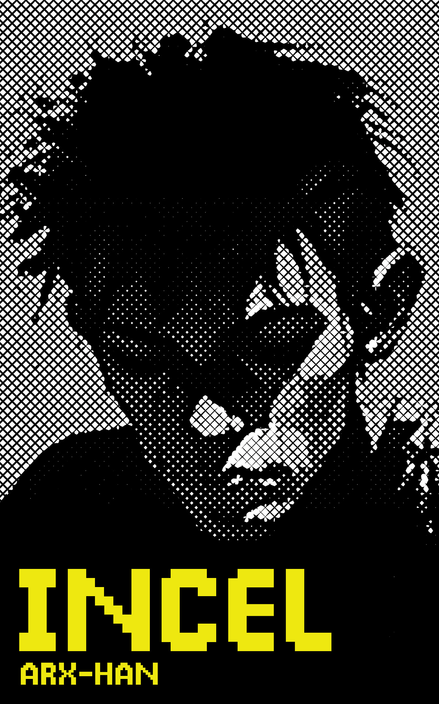
I listened to his advice, and, together with a good friend of mine, modified some existing AI-art to re-do the cover to what it is now and eliminate this category-confusion:
This took a couple of steps, including taking an original Adobe stock image and overlaying a pseudo-pixellated visual filter like the one used below:2
The original stock image in question was AI-generated, and while I’ve spent a lot of time bitching about AI replacing human artists, when it comes to visual art, I have to admit that it simply doesn’t bother me as much.
I think what’s effectively happening with generative AI art is a machinic capture of the human spirit, with the generative outputs being ghostly afterimages of human consciously-produced works.
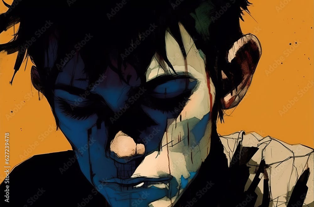
Here’s the original source image by the excellent AI-artist Oleksii Halutva:
It’s surprisingly evocative, isn’t it? The reason, of course, is that machine has absorbed the feelings of millions of human artists, producing a kind of epiphenomenal mirror of human emotion. I love this image: not because it came from a machine—but because, fundementally, it came from humans.
It was merely transduced by a machine.3
But the real reason I picked this image is because it also mirrors the cover of an earlier, perfect novel, John Williams’ Stoner:

After re-branding my novel with a more serious, literary form, sales improved relative to the previous baseline by a significant margin (I’ve now sold 333 books). It’s hard to parse out the causality here but it did seem like the bump was attributable to the reduction in visual category-confusion for readers browsing Amazon (in addition to Ross Barkan’s wonderful review, of course).
All in all, I continue to have a lot of fun with the process of writing and self-publishing fiction, although it’s been a fairly time-consuming process to handle everything as a solo mini-entrepreneur.
Do I recommend it?
Yes—so long as you love the process, like I do.
If any of you are curious, I obviously don’t look like this in real life.
(IRL, I’m 6’5 with a perfect Manchurian jawline and bench-press 350 lbs for reps).
I’m a bit unusual in that I really enjoy visual art direction even if my own actual artistic skills are nonexistent on this front.
As coaxed out by a human prompt engineer—itself a form of artistry, no doubt.


For what it’s worth, I love how deeply you’re thinking and tinkering with the aesthetics of your book—I haven’t read it, but if a physical edition is available (does Amazon self-pub still do POD?), I’d definitely be interested in checking it out.
Both versions of the covers you ended up using are pretty awesome tbh! 👏
I liked the manga cover personally , not even being a manga enjoyer myself, but now I understand your reasoning behind the change.